Showing posts with label Mini's. Show all posts

Thursday, July 2, 2015

2015 Gypsy Queen - I Shall Build Thee

It dawned on me the other day that I was much more passionate about new release cards back in 2011. Inspired by the pending arrival of my son that July, I had just gotten back into our glorious hobby after nearly two decades of complete cardboard nothingness. Essentially, I collecting like a chicken with his head cut off those first few months back in the fray. I was buying a little of this and a little of that but buying some of everything that came out. Unfortunately, this didn't last long enough to include 2011 Topps Update (TROUT!), but that's another discussion.

To show for my economic contributions, I am very proud to have a complete, hand-collated "birth year" set of 2011 flagship and Archives for my son to flip through one day and enjoy (or trade for a video game, or sell for beer money, whatever path he takes). I am also darn near close to completing the Heritage and Gypsy Queen sets from that year - with one and twelve cards remaining, respectively. Check out my NEEDS list and see if we can help each other! Not too bad though, overall.

But as you can divulge from my posts over the years since, my personal collecting habits have begun to steer away from modern releases. There's a myriad of reasons - some quite empirical while others are a bit more philosophical. It can be expensive to complete sets, pack by blaster by pack. Especially when you can just drop a little over $20 and bring entire Series home with no collating fuss and shipping included. The sellers usually even throw in a nice box. It's quite the inner conflict for this Collector, I assure you.

Because I still like to open packs of baseball cards!

There's still that rush to be had and, truth be told, there are still some pretty cool cards being made from a design perspective. The return on investment has become awfully risky, but there's no doubting the quality of photography and overall card construction for most sets...for the most part.

Enter son #2.

My family welcomed our third child into the world back in March, It's been a glorious, chaotic and beautiful circus ever since as we figure out life as a family of 5. I wouldn't trade it for the world! And since I'm a fair and just father (or at least strive to be), I can't help but look upon those great hand-collated sets from 2011 in my Card Cave. And then I look at what I'm doing for my youngest...and then I feel the itch to right the wrong....

And then I find myself in the card aisle at Target with a blaster of 2015 Gypsy Queen in my hand!

Yep. I'm at it again - officially, I'm announcing that I will be pursuing the complete base set of 2015 GQ for my kid. I have a long way to go after only (6?) or so rack-packs, but I figure that I have some time. I'm not sure if I'll chase all of the SP's like I did in 2011. I can't afford to make the rookie mistake again of buying all GQ blasters in the state, as much as I'd like to...and that's okay. I think everyone will understand.

In the meantime, it was a lot of fun to rip some packs and explore the latest edition of a set that is very sentimental to me. Here's a quick glance at some of my favorites:


The Shelby Miller represents what is probably my biggest "hit" of the rack packs, being a #'d /199 mini parallel. I'm a Braves fan, so this was a nice little bonus and the GQ mini's have slowly earned my appreciation over the years. I wish I could go back to 2011 when I amassed a considerable portion of a complete set of mini's. I didn't really understand what they were or how special it would have been to gather the whole run, so I ended up trading many away. That's okay - all part of the process.

BOOM! The next best thing to pulling a Brave is pulling THE Brave that managed to elude the Atlanta front-office rebuilding cyclone last off season and one of my top Player Collections - Freddie Freeman! This mini is a great addition and I can't wait to "binderize" the Freeman stack that sits atop the Card Cave table of chaos. Here's a look at the back of these cards, because I really love the GQ backs, despite their stat-less existence:


I thought this was a pretty cool insert as well:


Undoubtedly a vintage, throw-back insert set that I need to go research on Cardboard Connection, I enjoy the simplistic old-time feel of this art card. It's also a mini parallel, so unless I decide to go all out for mini completion, I might end up swapping this one out for regular sized cards that I need for my set-building efforts. Here's the back, so that we can all learn about "Crowding the plate":


Moving on from the smaller cards, here is a regular-sized insert card of Robbie Cano entitled, "Pillars of the Community". What a great concept for a baseball card! We're often inundated with only the very worst news and stories regarding our diamond heroes but Topps has decided to swim upstream and provide an encouraging look at some charitable efforts being made by ball players in their teams' communities.

Concept aside, this is a beautiful card. The image of Seattle is really sharp and means a little bit more to me as a former resident. I wonder if there was a discussion about working SAFECO Field into the background? In the end, I believe the Space Needle works better as the most iconic landmark for the Emerald City. At least they didn't go with the original Starbucks, am I right?


Here's the back of the "Pillars" Cano card:


I first noticed "celebration" and "walk-off" cards in the Opening Day and flagship sets a couple of years ago and I was immediately a fan. I think these types of cards capture the best parts of baseball - teamwork, family, competition, achieving your goal, having fun, etc. I think the concept works well in the Gypsy Queen format and this Royals card is a great example. Like the Pillars card above, I can't wait to see other cards from this insert set. Enjoy:


As I've mentioned before, I enjoy cards that pay tribute to a specific game or event and take care to match relevant images with relevant card-back write-ups. This GQ Walk-Off Winners card delivers on both accounts when I flipped this card over:


Part of the marketing effort by Topps includes the "bonus" pack of white-bordered parallel cards that accompany each rack pack. Sometimes these annoy me - other times, they look really nice and end up serving as excellent TTM material. I admit, the crisp white borders do look pretty nice - and are always welcome when they surround a new Mike Trout card:


Here's another white parallel that I thought looked awfully sharp:


In addition to the Freddie shown above, I had another great pack-ripping moment when I pulled an Anthony Rizzo base card! Yes, I am old and still get excited about base cards of my favorite players - no shame in my collecting game. Of course, now I need another one if I am going to "finish the race" and set this one aside for my son's set. Good thing I love the little guy :)


Here's the back - are the GQ card-back write-ups getting shorter? I know they were always succinct by design, but this one seems fairly random (which I do appreciate) and sparse at only four lines with additional blank space to be had towards the bottom. Thoughts?


Okay, so I have some work ahead of me to get my 2015 GQ NEEDS List posted, but hopefully I can stay the course and make a best effort to pull together some nice birth year sets for my youngest boy. Feel free to drop me a note if you think we can work out a swap. Long live set-building!

Thanks for reading -

Ryan


Monday, May 12, 2014

Some 2011 Gypsy Queen Help from the Daily Dimwit!

Sam over at The Daily Dimwit was kind enough to send over a few cards that I needed for my 2011 Gypsy Queen collection.   Sam and I both share a love of that set, the very first of the Gypsy Queen releases.   It holds a special place in my collecting heart as THE first cards that purchased when returning to the hobby after a 20+ year hiatus.   If only I had stashed away a few more blasters......

Sam has an AMAZING close master set of 2011 Gypsy Queen.   Relics, framed mini's, mini's, parallels, autographs.....ALL OF IT.   He lacks only a couple of white whales, and by that I mean cards like the Koufax autograph, Hank Aaron auto, etc.   It's incredible and a true testament to the set-builder and collector that Sam is.   Sam's also just a good guy....one of the first that welcomed me into our modern hobby digital community.

I made the mistake of not holding on to all of my mini cards.   I still have a bunch, but as I was not quite sure how to handle these odd-sized micro cards (no such thing existed in my previous collecting life?!), I sent off many of them to good homes in the form of trades or goodwill packages.

That being said, I was all about the insert sets and SPs.   In fact, I wasn't even quite sure what a "SP" was, but I think this may have worked in my favor.   Kind of an 'ignorance is bliss' sort of event.   I never got frustrated over how challenging it was to find these 50 cards, I simply kept hunting as a happy, numerically and linearly-inclined set-builder.

Man, those were the days!

Anyways, I still need a couple inserts and SPs but thanks to Sam, I can now cross these off the list.   Thanks, Sam!


OH, did I leave a glare on Buchholz's card or is that just a foreign substance?

Wednesday, April 18, 2012

Gypsy Queen 2012 - First Look!

I've filibustered enough about my anticipation of this year's Gypsy Queen release........how about some looks at the real thing?

Let's DO this.   Here we go!

First, let's take a look at the base card design, front and back, with some Yankees legends!


Joe D and the Mick - you can't go wrong.  Love this shot of Mantle!

The front design of this year's edition works nicely in my opinion!   It's soft and under-stated, working quite well to compliment the mini works-of-art displayed for each player on ever card.   I prefer the bottom location of the "Gypsy Queen" name over last year's header, although I feel like the player's name and team might have been better above the logo.   That's okay, though.   The lines and slightly floral borders are simple enough for me and do a great job of framing the card.   Great job, Topps!


Sticking with what works.

The backs look very similar to last year's and I couldn't be more satisfied.   Sure, there's no stats - but this is the RIGHT way to pull off a simple card back.   I hope you're paying attention, Lineage!   Let's move on to the inserts:


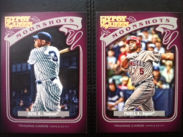
I'm thrilled to pull the Babe while Albert would be thrilled to have a Moonshot in '12!

Let's get my least favorite part of this year's release out of the way first, shall we?   I don't care for the design of these "Moonshots" cards at all.   These cards should have been a dark blue or gray and featured some kind of design that incorporated.....wait for it.....the moon.   The premise of having a "Moonshot" subset?   Awesome!   But the purple color, tilted flowing ribbon and asymmetrical corner GQ logo just doesn't fall in-step with the classic and artistic feel of the rest of the set.   Scrap this purple dye, Topps.  


Ah-ha!   We're getting better.   I thought that last year's "Wall Climbers" and "Sticky Fingers" subsets were really innovative ideas and well designed.   Sure - you picked up a lot of them as they were each only 10 cards - but the idea was fresh.   I see this year's "Glove Stories" and "Sliding Stars" picking right up where 2011 left off.   This Josh Hamilton is a great card!   Great picture with a matching write-up on the back that captures the moment from last season.   The brown color chosen for this set 'synchs' well with the subset's theme and is easy on the eyes.   The GQ logo takes up a bit too much room at the bottom but at least it is at the bottom.  


Emphasis on FUTURE, eh Mike?!   (sigh)

The "Future Stars" subset makes a return from last year.   The design is actually fairly similar, so it's not very exciting - but at least Topps didn't use Barney as a muse for the color choice.   The blue border from these inserts might have worked well for the "Moonshots" cards, don't you think?   The GQ logo is identical to the footer version featured on the "Glove Stories" - still too big, but acceptable.


Willie & Mickey


"Hallmark Heroes" takes the place of the "Great Ones" insert set, featuring some of our all-time favorite ballplayers.   This design works for me just fine.   It's pretty simple and is a bit more attractive than the all-brown border of the "Great Ones".   I think if I could change two things, it would be to emphasize the "Hallmark Heroes" header a bit more and, once again, find a way to minimize the the GQ medallion at the bottom of the card.   I would also expand the picture a bit on this one - too much border covers up what appear to be some great old pictures.


YES!   I love these "Sliding Stars" cards!   I haven't pulled any of players I personally love (I pulled two other Sliding Stars cards of two players from that chicken & beer outfit) but this design is perfect.   Great shots, fantastic sideways orientation (appropriate for sliding, naturally) and a well-balanced symmetrical border that completely emphasizes the vibrant color sketch/photo.   Well done, Topps!


Of course, Gypsy Queen also provides us all with plenty of mini's.   I know a lot of you out there went into hot pursuit of these miniature cards and crafted some great completions of team sets, franken-sets and even a couple of complete parallel mini sets!   That's pretty impressive!   I will undoubtedly pursue mini's and mini variations of my Yankees and Braves but will probably put most of the mini's I pull up for trade.   I'll sort out my '12 GQ goals soon and have a WANTS/NEEDS page soon, I'm sure!

There are variations to the mini's again this year and, to be honest, I'm not even sure that I understand them all quite yet.   But here's a look at what I was able to pull from my small sampling:


Right off the bat, you can see here that the Brian Wilson is some sort of 'green' mini parallel.   The Fab High-Fivin' Freddie Freeman represents the standard, base mini parallel.   Standard-base-mini-parallel.......sheesh!   Love pulling the Freddie, though!   He just hit his FIRST home run of the season, too.   Looks like that day of rest may have done him some good and I hope he keeps it up!   Okay, here's a look at the backs:


AH!   Wait a second!   That Freeman wasn't the standard mini parallel after all - it is a "Straight Cut" back variation.   Kind of cool, I guess.   The Gypsy lady replaces the team logo at the top.   Some more mini's:


If I'm gonna love a mini, it's much easier for me to love mini's of some great players and these miniature versions of Jackie and Willie are no exception.   Great shots and the standard-size version of the Jackie is just as beautiful.   Let's take a look at the backs to see if Topps can mix it up even more:


Well, of course they did!   Here we see that the Stargell is a "Red" back variation and the Robinson is another "Straight Cut" variation.   As a collector, I can definitely see how the pursuit of some or all of these miniature variations gets some folks VERY excited.  It IS kind of cool.   Good luck to you guys!   I look forward to helping you out once I figure out which ones I want to hang on to.......are we done with mini's?  Not yet!  


Zack Attack.   Lego Maniac?


Black mini parallels!   Sharp little cards and, if I understood some blog posts over the past few weeks, these are tougher to find than they were last year?   Somebody set me straight if I'm off the mark here!   Let's flip 'em over:


More black.   Onward!   How 'bout them headache-causing SPs?   Topps switched it up with this release by making the SPs photo variations of certain base cards from the standard set.   same design, same back, same number.....different picture.   And sometimes, not even that different!   Sneaky Topps.   I haven't found a photographic checklist of what the SPs look like.   I know there are some for sale on the Bay of E but I am not sure how much I trust those listings that don't include a side-by-side comparison.   Part of my suspicion is the "?" included on a majority of the SP listings.   I DID however manage to pull both versions of two cards in my sampling.   Ironically, I am not even sure which version is the SP!   I'm sure we'll all k now soon enough, though.   Here they are:


See what I mean?   Not all that different.   Was very happy to have these two great ballplayers as my example, though!   Reggie and the Freak.

How about some HITS?

Gypsy Queen afforded me the most hits during my trials and tribulations as a hobby-returnee last year.   It always seemed to deliver some ink or a relic or a numbered card while other releases never produced.   I know - it's just luck and more than likely, some kind of placebo effect.

But it works for me.

This year has started off no differently!   No hits yielded by the flagship or by Heritage but GQ has come through.   There's some irony, though, potentially some karma coming around to bite me in return for all of my 'chicken and beer' ragging.   Honestly, I chuckled out loud when I pulled this.   Sure I would have preferred one of my Yankees....or one of my Braves.......or.....ANYBODY else.  

But that's what trading is for!   Who wants some Big Papi?


Give David a napkin, will you, Rod?

Two jersey relics!   One framed-mini and one standard jersey relic.   Pretty standard design,   They work JUST fine for me!   Sure, these are of the base model "plain white swatch" variety but these represent two more relics than I've pulled from EVERYTHING else so far.   NO, 2011 Lineage - you don't count.   Like I mentioned, the Ortiz is definitely up for trade if anybody manages to pull a non-beer & chicken guy.

:)

The Carew may be too, but I might hold on to it as well.   You can't beat a piece of memorabilia from a Hall of Famer!   Here are the backs - pretty standard.


We're almost done!   Here are some more highlights of other base cards that I was fortunate enough to pull:


Mark - there's a chia pet on your arm!

El Capitan and 'Mo

Mr. Saves and Mr. Needs To Start Hitting

Albert.   Home runs.   Now.


Yadier, you 'da man!


Whew!   I'm exhausted.   Very enjoyable, though.   Great ripping!   There were definitely some parts of this set that fall short of what I had expected but overall I am very excited to start chasing this set for my collection.   The basic design works very well and the thick stock feels great.   The pictures are pretty cool, too.   Any of these qualify as GREAT candidates for autographs, by the way.   I will be chasing all of the insert sets (even YOU, Barney Moonshots) but I am not sure if I will pursue the photo-variation SPs like I did last year's #300-#350 SPs.   The mini's make my head spin with all of the variations.   I think I will focus on my teams and favorite players.   I loved the autographs from last year's release and I can't wait to pull a few this year!   Here's hoping!

Some other quick odds and ends observations:

- There are no numbers for the insert sets.   They use the player initials.  Meh.
- There are no rigid all-white dummy cards in the packs.   Drats!   Those things were AWESOME for shipping trade packages!   Grrrr!
- Notice there were no green-framed parallels or gold-framed parallels for me.  Last year, I am certain there would have been several.   I am supposing that means the framed cards are more rare this year?
- No checklists.   Not complaining.   Just noting.   I'm sure THAT comment will come back to haunt me.
- No Yu

What do you guys think of 2012 Gypsy Queen?   Will you be collecting this set or certain parts of it?   Did Topps regress, improve or coast along with the status quo on this one?   Is it "mini's" or "minis"?

If you're still with me - thanks for reading!