I've filibustered enough about my anticipation of this year's Gypsy Queen release........how about some looks at the real thing?
Let's DO this. Here we go!
First, let's take a look at the base card design, front and back, with some Yankees legends!
 |
| Joe D and the Mick - you can't go wrong. Love this shot of Mantle! |
The front design of this year's edition works nicely in my opinion! It's soft and under-stated, working quite well to compliment the mini works-of-art displayed for each player on ever card. I prefer the bottom location of the "Gypsy Queen" name over last year's header, although I feel like the player's name and team might have been better above the logo. That's okay, though. The lines and slightly floral borders are simple enough for me and do a great job of framing the card. Great job, Topps!
 |
| Sticking with what works. |
The backs look very similar to last year's and I couldn't be more satisfied. Sure, there's no stats - but this is the RIGHT way to pull off a simple card back. I hope you're paying attention, Lineage! Let's move on to the inserts:
 |
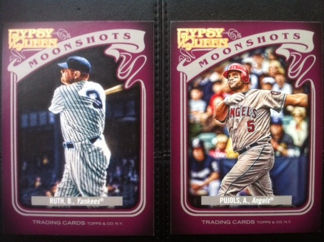
| I'm thrilled to pull the Babe while Albert would be thrilled to have a Moonshot in '12! |
Let's get my least favorite part of this year's release out of the way first, shall we? I don't care for the design of these "Moonshots" cards at all. These cards should have been a dark blue or gray and featured some kind of design that incorporated.....wait for it.....the moon. The premise of having a "Moonshot" subset? Awesome! But the purple color, tilted flowing ribbon and asymmetrical corner GQ logo just doesn't fall in-step with the classic and artistic feel of the rest of the set. Scrap this purple dye, Topps.

Ah-ha! We're getting better. I thought that last year's "Wall Climbers" and "Sticky Fingers" subsets were really innovative ideas and well designed. Sure - you picked up a lot of them as they were each only 10 cards - but the idea was fresh. I see this year's "Glove Stories" and "Sliding Stars" picking right up where 2011 left off. This Josh Hamilton is a great card! Great picture with a matching write-up on the back that captures the moment from last season. The brown color chosen for this set 'synchs' well with the subset's theme and is easy on the eyes. The GQ logo takes up a bit too much room at the bottom but at least it is at the bottom.
 |
| Emphasis on FUTURE, eh Mike?! (sigh) |
The "Future Stars" subset makes a return from last year. The design is actually fairly similar, so it's not very exciting - but at least Topps didn't use Barney as a muse for the color choice. The blue border from these inserts might have worked well for the "Moonshots" cards, don't you think? The GQ logo is identical to the footer version featured on the "Glove Stories" - still too big, but acceptable.
 |
| Willie & Mickey |
"Hallmark Heroes" takes the place of the "Great Ones" insert set, featuring some of our all-time favorite ballplayers. This design works for me just fine. It's pretty simple and is a bit more attractive than the all-brown border of the "Great Ones". I think if I could change two things, it would be to emphasize the "Hallmark Heroes" header a bit more and, once again, find a way to minimize the the GQ medallion at the bottom of the card. I would also expand the picture a bit on this one - too much border covers up what appear to be some great old pictures.
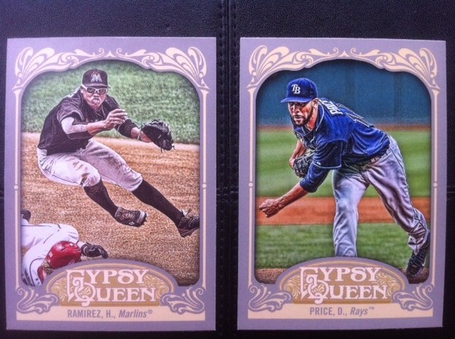
YES! I love these "Sliding Stars" cards! I haven't pulled any of players I personally love (I pulled two other Sliding Stars cards of two players from that chicken & beer outfit) but this design is perfect. Great shots, fantastic sideways orientation (appropriate for sliding, naturally) and a well-balanced symmetrical border that completely emphasizes the vibrant color sketch/photo. Well done, Topps!
Of course, Gypsy Queen also provides us all with plenty of mini's. I know a lot of you out there went into hot pursuit of these miniature cards and crafted some great completions of team sets, franken-sets and even a couple of complete parallel mini sets! That's pretty impressive! I will undoubtedly pursue mini's and mini variations of my Yankees and Braves but will probably put most of the mini's I pull up for trade. I'll sort out my '12 GQ goals soon and have a WANTS/NEEDS page soon, I'm sure!
There are variations to the mini's again this year and, to be honest, I'm not even sure that I understand them all quite yet. But here's a look at what I was able to pull from my small sampling:
Right off the bat, you can see here that the Brian Wilson is some sort of 'green' mini parallel. The Fab High-Fivin' Freddie Freeman represents the standard, base mini parallel. Standard-base-mini-parallel.......sheesh! Love pulling the Freddie, though! He just hit his FIRST home run of the season, too. Looks like that day of rest may have done him some good and I hope he keeps it up! Okay, here's a look at the backs:
AH! Wait a second! That Freeman wasn't the standard mini parallel after all - it is a "Straight Cut" back variation. Kind of cool, I guess. The Gypsy lady replaces the team logo at the top. Some more mini's:
If I'm gonna love a mini, it's much easier for me to love mini's of some great players and these miniature versions of Jackie and Willie are no exception. Great shots and the standard-size version of the Jackie is just as beautiful. Let's take a look at the backs to see if Topps can mix it up even more:
Well, of course they did! Here we see that the Stargell is a "Red" back variation and the Robinson is another "Straight Cut" variation. As a collector, I can definitely see how the pursuit of some or all of these miniature variations gets some folks VERY excited. It IS kind of cool. Good luck to you guys! I look forward to helping you out once I figure out which ones I want to hang on to.......are we done with mini's? Not yet!
 |
| Zack Attack. Lego Maniac? |
Black mini parallels! Sharp little cards and, if I understood some blog posts over the past few weeks, these are tougher to find than they were last year? Somebody set me straight if I'm off the mark here! Let's flip 'em over:
More black. Onward! How 'bout them headache-causing SPs? Topps switched it up with this release by making the SPs photo variations of certain base cards from the standard set. same design, same back, same number.....different picture. And sometimes, not even that different! Sneaky Topps. I haven't found a photographic checklist of what the SPs look like. I know there are some for sale on the Bay of E but I am not sure how much I trust those listings that don't include a side-by-side comparison. Part of my suspicion is the "?" included on a majority of the SP listings. I DID however manage to pull both versions of two cards in my sampling. Ironically, I am not even sure which version is the SP! I'm sure we'll all k now soon enough, though. Here they are:
See what I mean? Not all that different. Was very happy to have these two great ballplayers as my example, though! Reggie and the Freak.
How about some HITS?
Gypsy Queen afforded me the most hits during my trials and tribulations as a hobby-returnee last year. It always seemed to deliver some ink or a relic or a numbered card while other releases never produced. I know - it's just luck and more than likely, some kind of placebo effect.
But it works for me.
This year has started off no differently! No hits yielded by the flagship or by Heritage but GQ has come through. There's some irony, though, potentially some karma coming around to bite me in return for all of my 'chicken and beer' ragging. Honestly, I chuckled out loud when I pulled this. Sure I would have preferred one of my Yankees....or one of my Braves.......or.....ANYBODY else.
But that's what trading is for! Who wants some Big Papi?
 |
| Give David a napkin, will you, Rod? |
Two jersey relics! One framed-mini and one standard jersey relic. Pretty standard design, They work JUST fine for me! Sure, these are of the base model "plain white swatch" variety but these represent two more relics than I've pulled from EVERYTHING else so far. NO, 2011 Lineage - you don't count. Like I mentioned, the Ortiz is definitely up for trade if anybody manages to pull a non-beer & chicken guy.
:)
The Carew may be too, but I might hold on to it as well. You can't beat a piece of memorabilia from a Hall of Famer! Here are the backs - pretty standard.
We're almost done! Here are some more highlights of other base cards that I was fortunate enough to pull:
 |
| Mark - there's a chia pet on your arm! |
 |
| El Capitan and 'Mo |
 |
| Mr. Saves and Mr. Needs To Start Hitting |
 |
| Albert. Home runs. Now. |
 |
| Yadier, you 'da man! |
Whew! I'm exhausted. Very enjoyable, though. Great ripping! There were definitely some parts of this set that fall short of what I had expected but overall I am very excited to start chasing this set for my collection. The basic design works very well and the thick stock feels great. The pictures are pretty cool, too. Any of these qualify as GREAT candidates for autographs, by the way. I will be chasing all of the insert sets (even YOU, Barney Moonshots) but I am not sure if I will pursue the photo-variation SPs like I did last year's #300-#350 SPs. The mini's make my head spin with all of the variations. I think I will focus on my teams and favorite players. I loved the autographs from last year's release and I can't wait to pull a few this year! Here's hoping!
Some other quick odds and ends observations:
- There are no numbers for the insert sets. They use the player initials. Meh.
- There are no rigid all-white dummy cards in the packs. Drats! Those things were AWESOME for shipping trade packages! Grrrr!
- Notice there were no green-framed parallels or gold-framed parallels for me. Last year, I am certain there would have been several. I am supposing that means the framed cards are more rare this year?
- No checklists. Not complaining. Just noting. I'm sure THAT comment will come back to haunt me.
- No Yu
What do you guys think of 2012 Gypsy Queen? Will you be collecting this set or certain parts of it? Did Topps regress, improve or coast along with the status quo on this one? Is it "mini's" or "minis"?
If you're still with me - thanks for reading!